
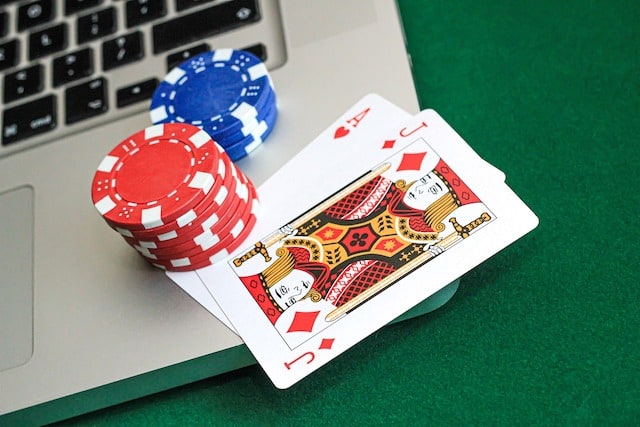
Multi-Platform Play in Poker Game Development: Bridging Desktop and Mobile Tables
Poker has always been a game of information, timing, and precision-but the screen it’s played on changes everything. On desktop, players get a wide, stable view of the entire table, multiple opponents, and clean access to controls. On mobile, that same experience is compressed into a vertical, touch-first interface where space is limited and attention is fragmented.
This creates a fundamental design challenge: how do you preserve the depth of a full poker table when the screen can barely show half of it at once?
In modern poker game development, this isn’t just a visual scaling problem-it’s a structural redesign problem. The goal is not to shrink the desktop experience but to reimagine how poker should feel on different devices while keeping the gameplay integrity intact.
The Hook: Solving the “Tiny Button” Problem in Mobile Poker
One of the fastest ways to break immersion in mobile poker is surprisingly simple: poorly designed buttons. When betting controls are too small, too close together, or visually unclear, players misclick at critical moments. Unlike casual apps, poker punishes these mistakes psychologically-even if the game logic corrects them.
Mobile poker introduces a unique limitation: precision input is replaced by thumb-based interaction. That shift alone changes how every action must be designed. A tap is no longer just a tap-it is a decision made under pressure with limited accuracy.
In poker game development, this becomes a core UX challenge because every interaction carries strategic weight. Folding, raising, or calling isn’t just navigation-it is commitment. If a player ever feels uncertain whether the UI will respond correctly, the entire experience loses trust. Good mobile poker design must eliminate ambiguity entirely, making every control feel intentional, large enough, and confidently responsive.
Rethinking the Poker Table for Mobile
A traditional 9-handed poker table simply doesn’t translate cleanly to a vertical phone screen. Trying to force it into place leads to clutter, unreadable player stacks, and a confusing interface.
Instead, modern mobile poker design focuses on selective visibility. Rather than showing everything at once, the UI highlights what matters in the moment:
- The player’s own hand remains always visible
- Active opponents are prioritized dynamically
- Secondary information collapses or shifts contextually
Some implementations use scrollable seating, while others “rotate focus” depending on turn order. The goal is not to simulate the full table visually at all times, but to simulate understanding of the table at all times.
Adaptive UI Layouts: Beyond Simple Responsiveness
Many systems rely on responsive design-simply resizing elements to fit smaller screens. But poker requires more than resizing; it requires restructuring.
Adaptive UI takes a different approach:
- The interface changes based on game state
- Controls expand when it is the player’s turn
- Non-essential elements fade or collapse during action phases
This dynamic behavior reduces cognitive load. Instead of presenting everything at once, the UI reveals only what is necessary for the current decision. It keeps attention focused on the most important action at any given moment.
In practice, this means the same poker game can feel calm and informational while waiting, but fast and highly interactive during betting rounds.
Gesture-Based Betting: The Future of Interaction
Buttons are only one way to interact. On mobile devices, gestures often feel more natural and fluid than static controls.
Modern poker interfaces are increasingly experimenting with gesture-based systems:
- Swipe up to raise
- Tap to call or check
- Drag to adjust bet size
These interactions reduce screen clutter while increasing speed and intuitiveness. Instead of hunting for small buttons, players perform natural movements that map directly to their decisions.
However, gesture systems must be carefully designed. Without clear visual feedback, they can feel ambiguous or risky. A strong design always includes confirmation states, preview values, and clear animation responses so players feel in control at every step.
Solving the “Tiny Button” Problem Properly
Even with gesture systems, traditional buttons still play a role in poker interfaces. The key is making them impossible to misinterpret or miss.
Good mobile poker design follows a few core principles:
- Large tap targets designed for thumb zones
- Clear spacing between critical actions
- Strong visual hierarchy for important controls
- High contrast between interactive and passive elements
What must be avoided is overcrowding. When too many betting options are displayed at once, players slow down, hesitate, and lose confidence in their decisions. Simplicity is not just aesthetic-it is functional clarity.
Cross-Platform Account Synchronization
Modern poker players rarely stay on one device. They might start a session on desktop and continue later on mobile, or vice versa. This makes seamless synchronization essential.
A well-designed system includes:
- Real-time bankroll updates across devices
- Persistent session state (no lost hands or progress)
- Cloud-based profiles and game history
This continuity builds trust. Players feel like they are interacting with one unified system rather than separate apps. It also increases engagement, as users can move freely between environments without friction.
Maintaining Consistency Across Platforms
While the experience must adapt, it should not feel like a different game on each device.
Consistency is maintained through:
- Unified visual identity (cards, chips, animations)
- Identical game rules and outcomes
- Familiar interaction patterns across devices
The difference lies in how those elements are delivered:
- Desktop focuses on precision and full visibility
- Mobile focuses on clarity and gesture-driven control
The goal is not sameness-it’s coherence. Players should always feel like they are playing the same poker game, regardless of screen size.
Performance and Responsiveness
Poker is a real-time decision game, which means performance directly impacts trust. Even small delays can feel like instability or unfairness.
Key optimization strategies include:
- Lightweight animations that don’t block input
- Fast, predictable response to player actions
- Efficient asset loading for cards, chips, and UI elements
Network latency is another critical factor. A poorly optimized system can make betting feel delayed or unresponsive, which is unacceptable in competitive environments.
Smooth performance is not just technical polish-it is part of game fairness perception.
Common Mistakes in Multi-Platform Poker Design
Many poker apps fail not because of gameplay issues, but because of UX shortcuts:
- Shrinking desktop UI instead of redesigning for mobile
- Overcomplicated gesture systems without clear feedback
- Ignoring thumb ergonomics and reach zones
- Inconsistent behavior between devices
- Lack of proper testing across screen sizes
These mistakes all lead to one outcome: loss of player confidence.
Conclusion: Designing for Context, Not Just Screens
Multi-platform poker design is not about duplicating a desktop experience on mobile-it is about adapting the experience to human behavior in different contexts.
In poker game development, the most successful systems are those that respect how players interact differently depending on their devices. Desktop allows precision and overview; mobile demands clarity and immediacy.
When done well, players should never feel like they are switching versions of the game. Instead, they should feel like the game is simply adapting to them-smoothly, intelligently, and without friction.
That is the real goal of modern poker UX: not just to fit the table on the screen, but to fit the experience around the player.